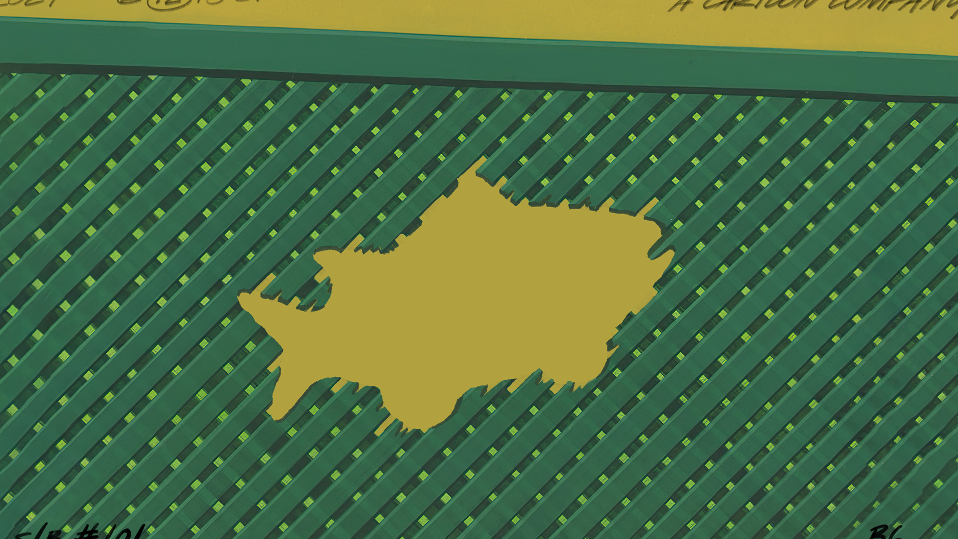
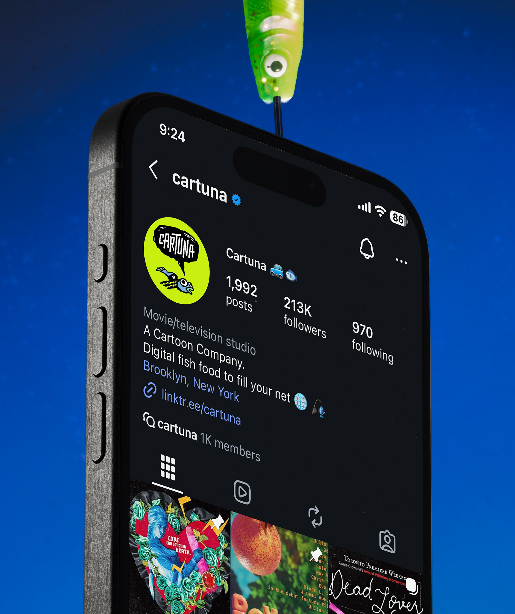
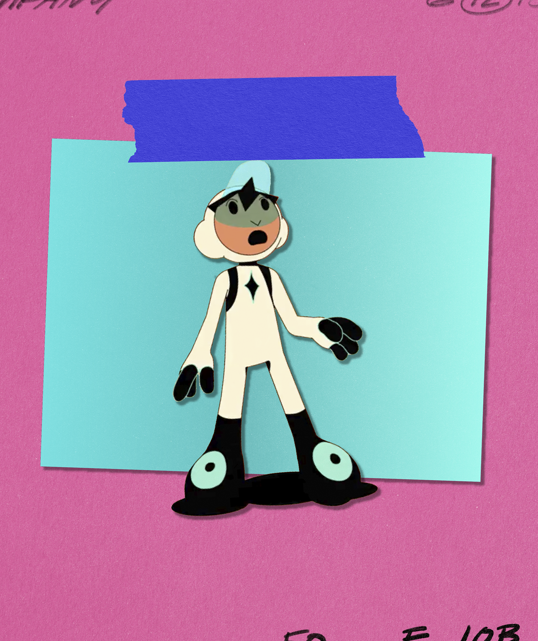
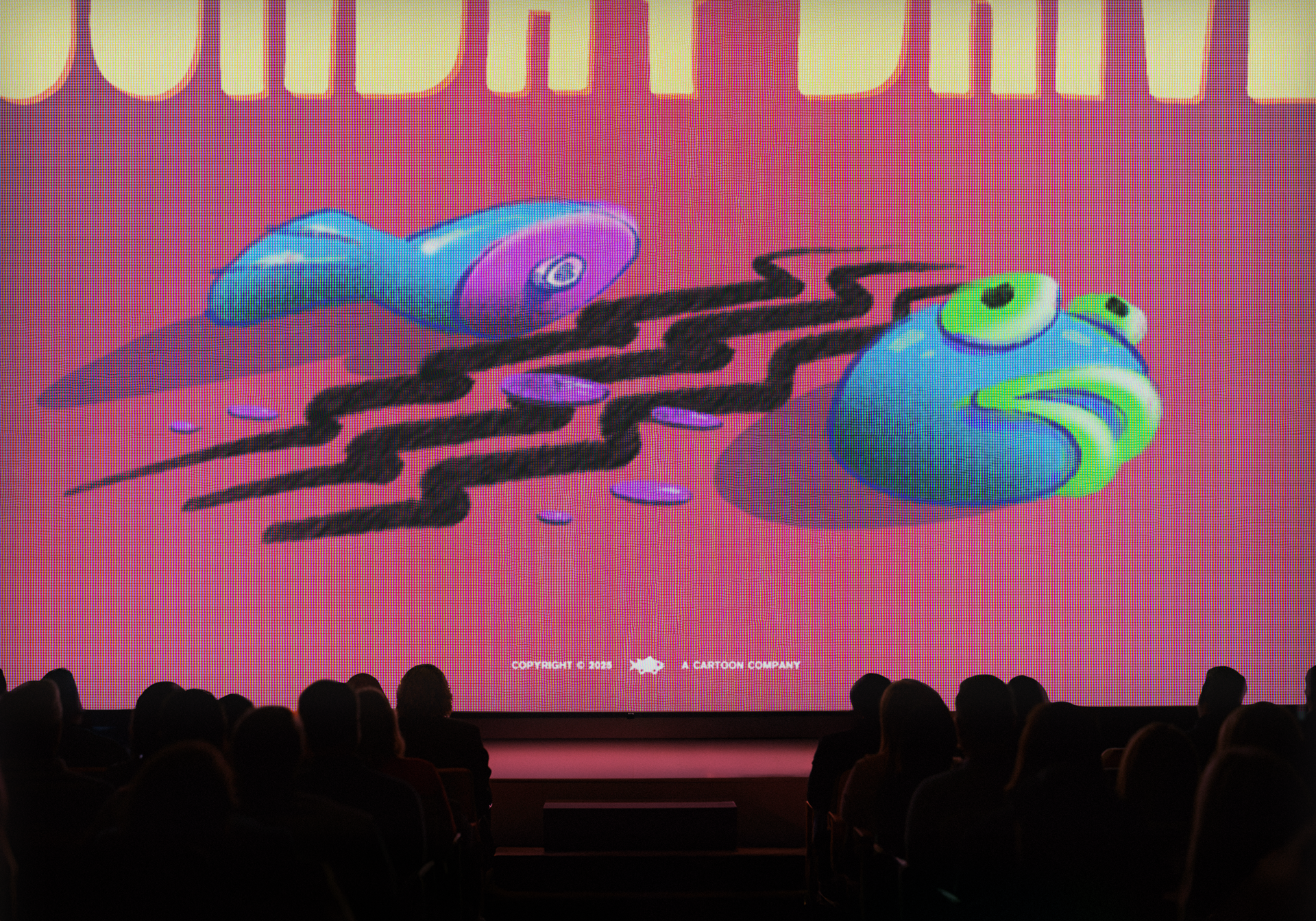
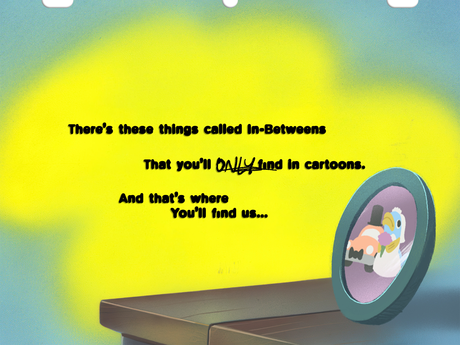
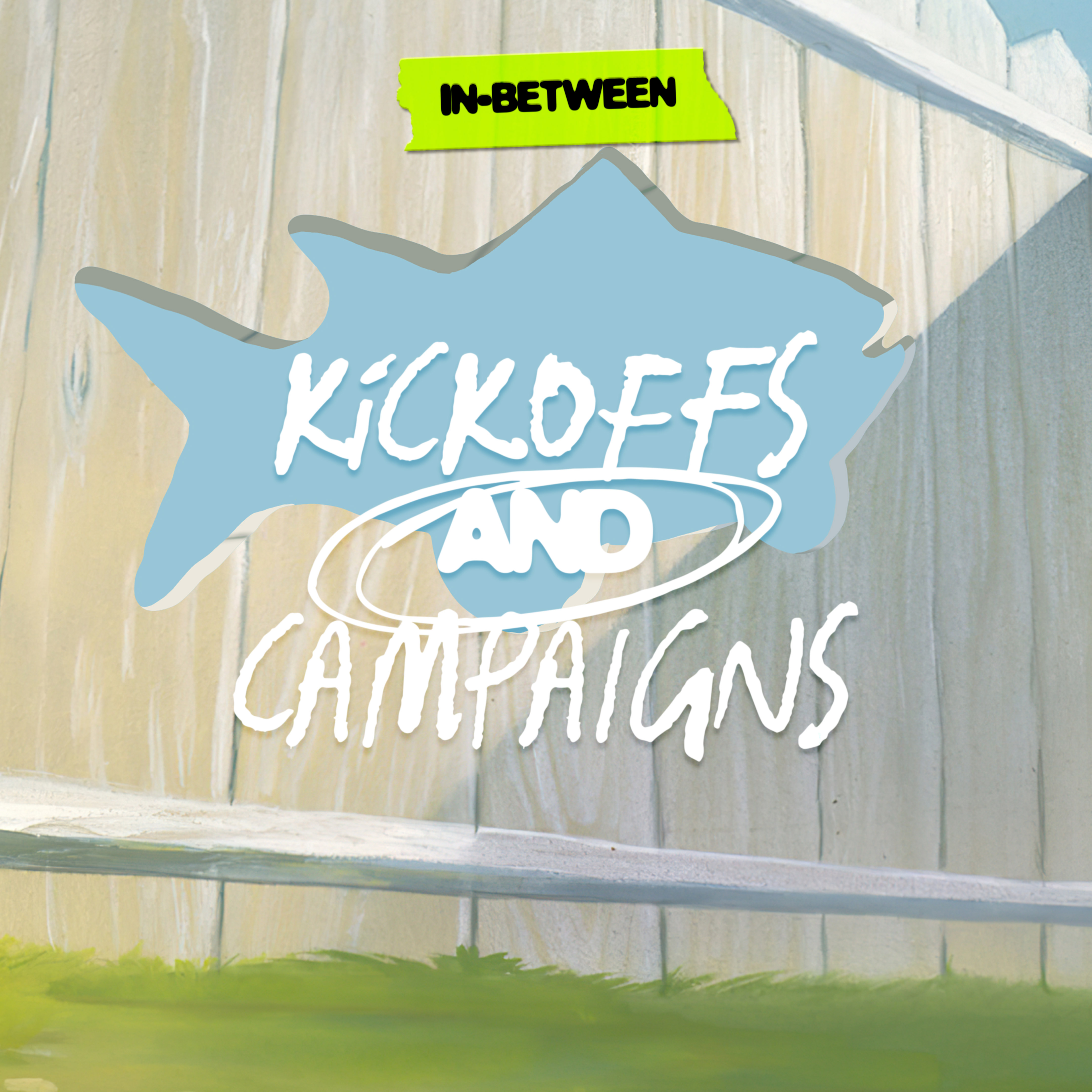
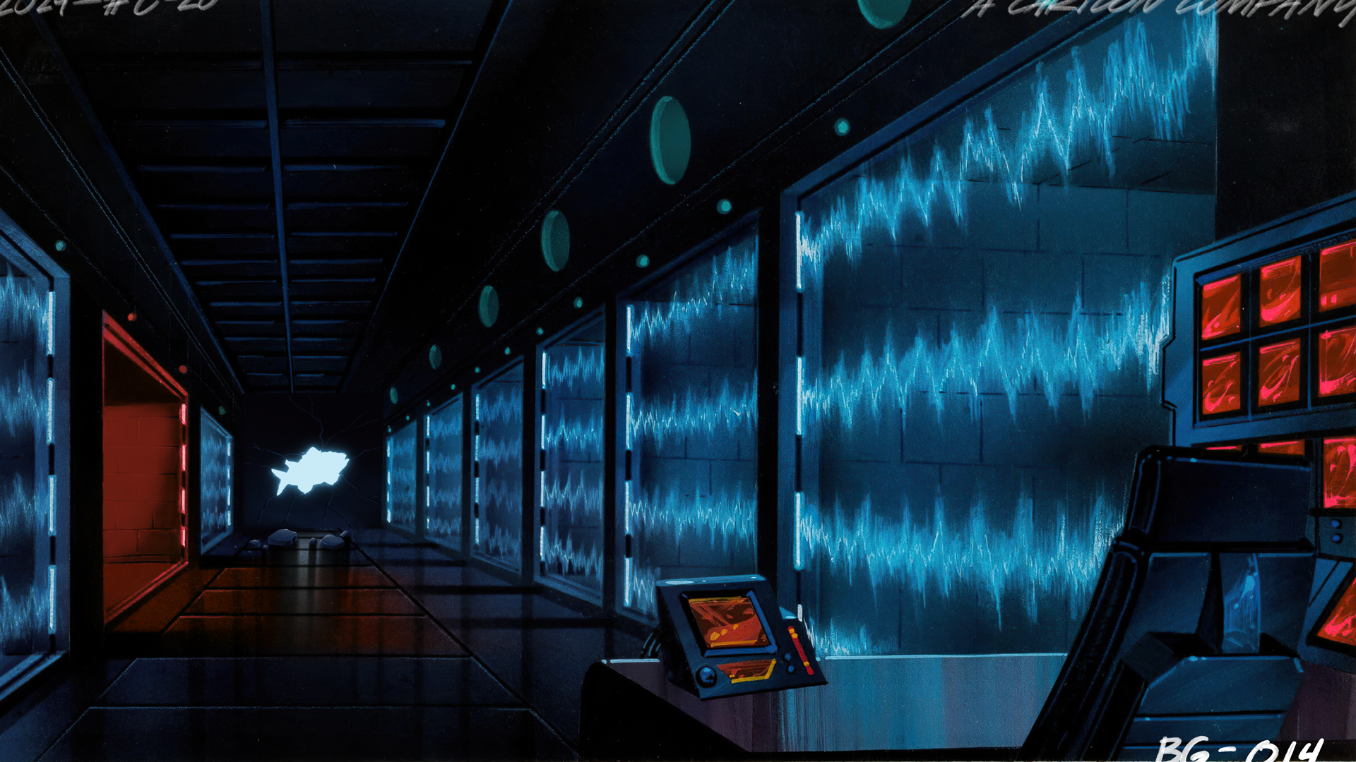
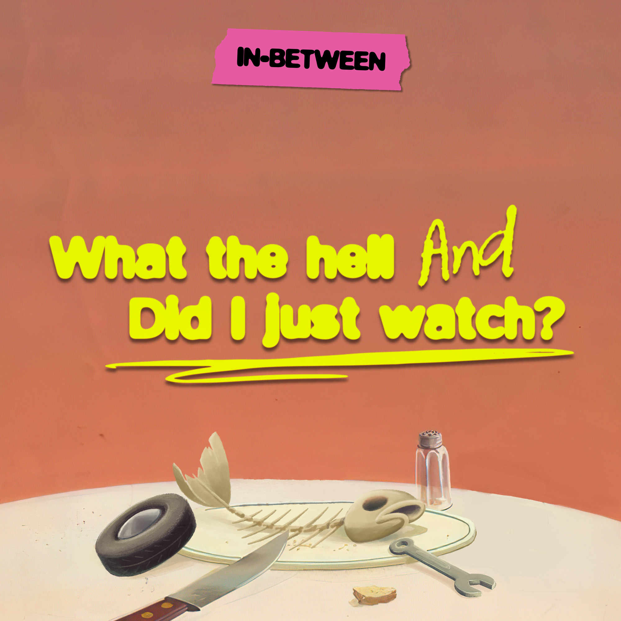
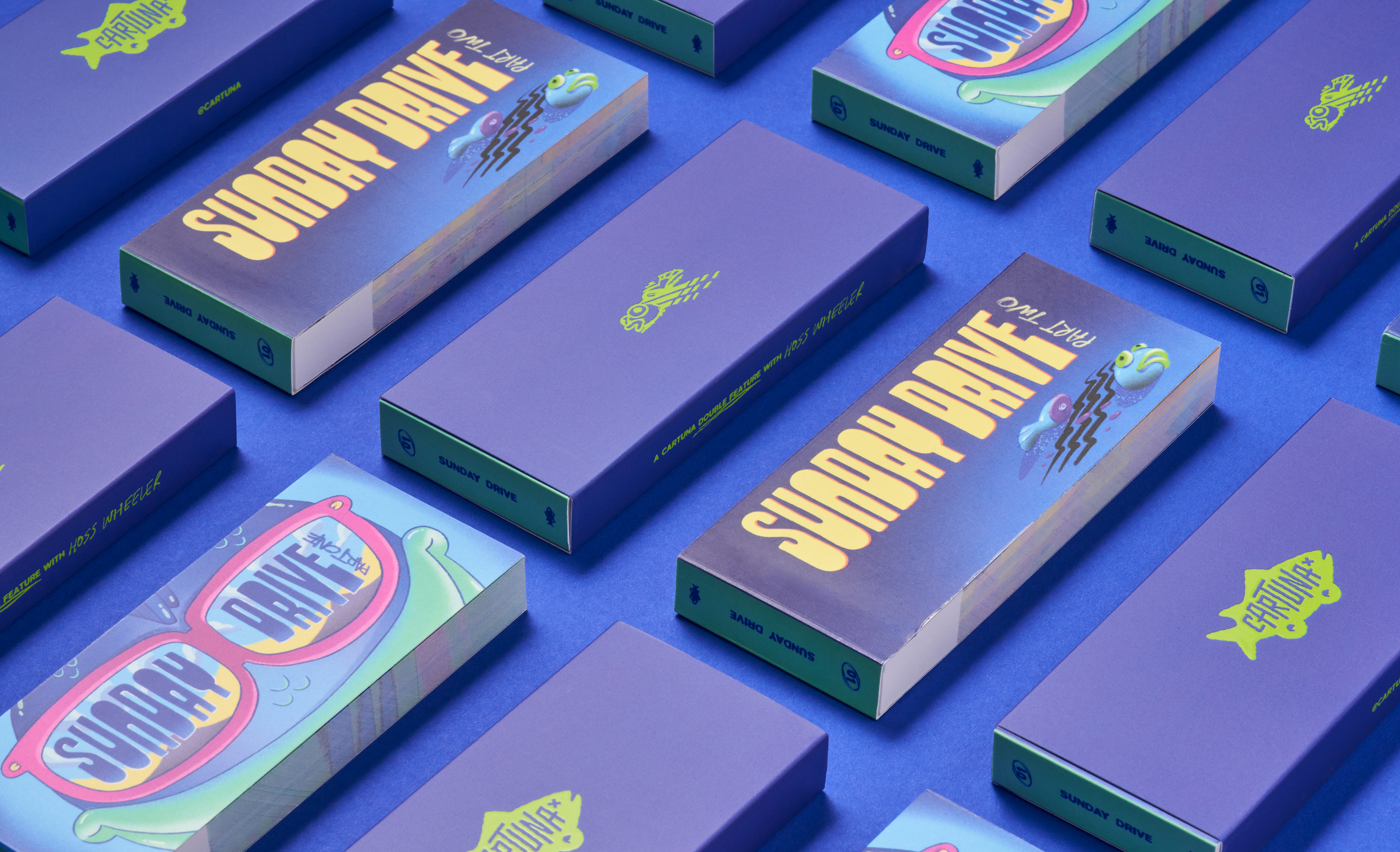
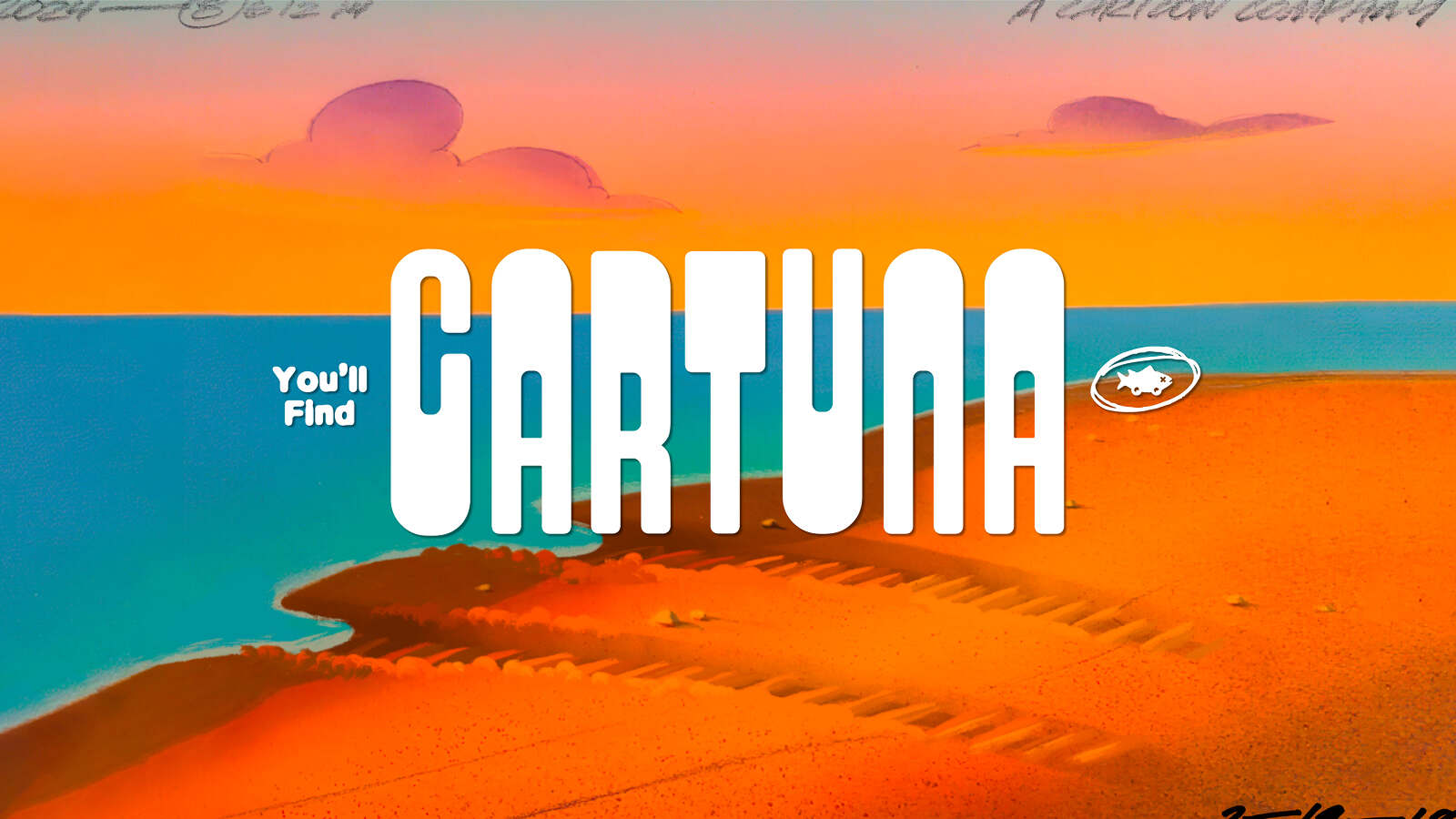
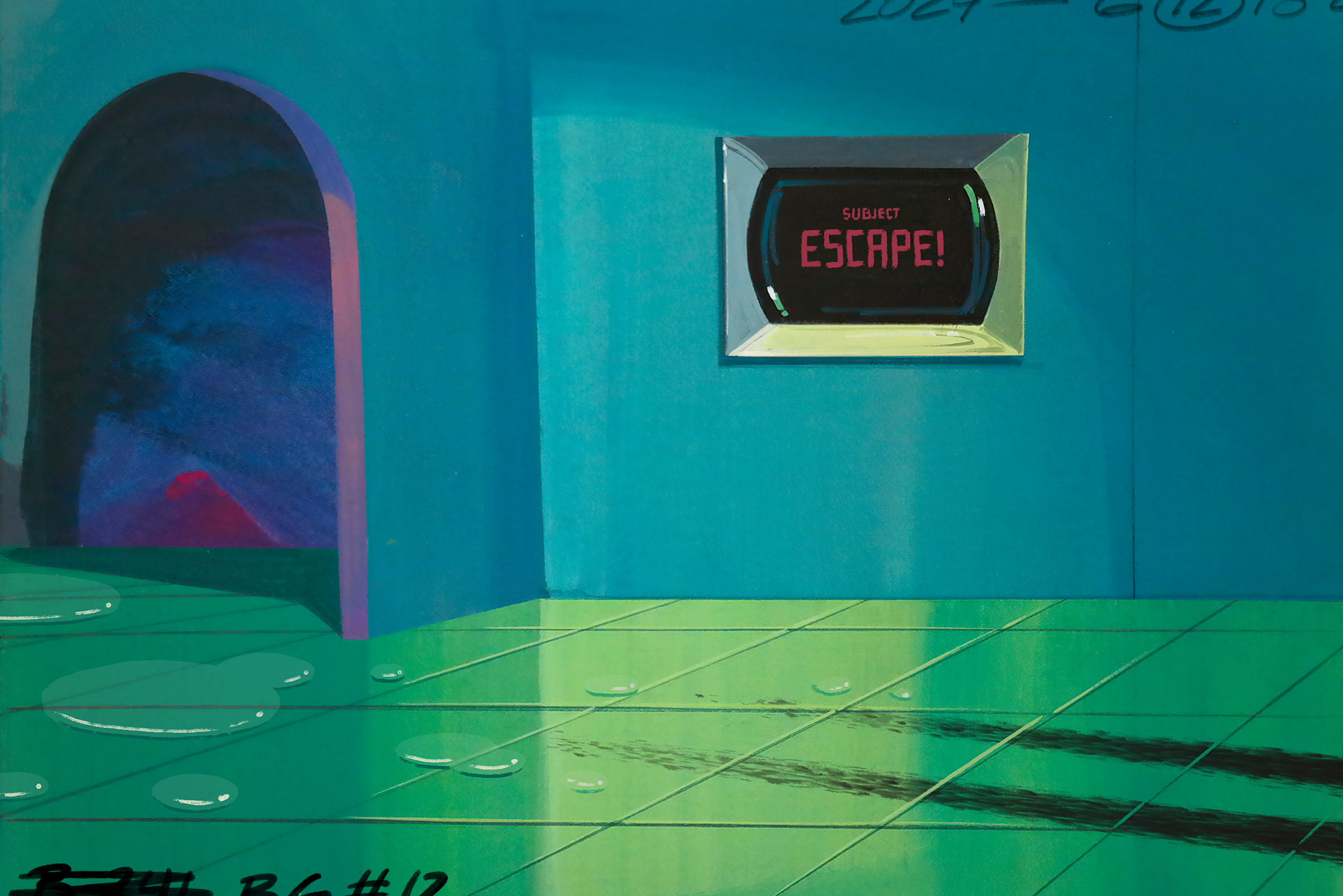
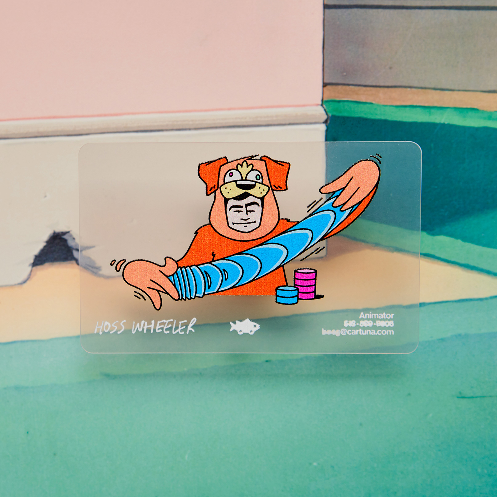
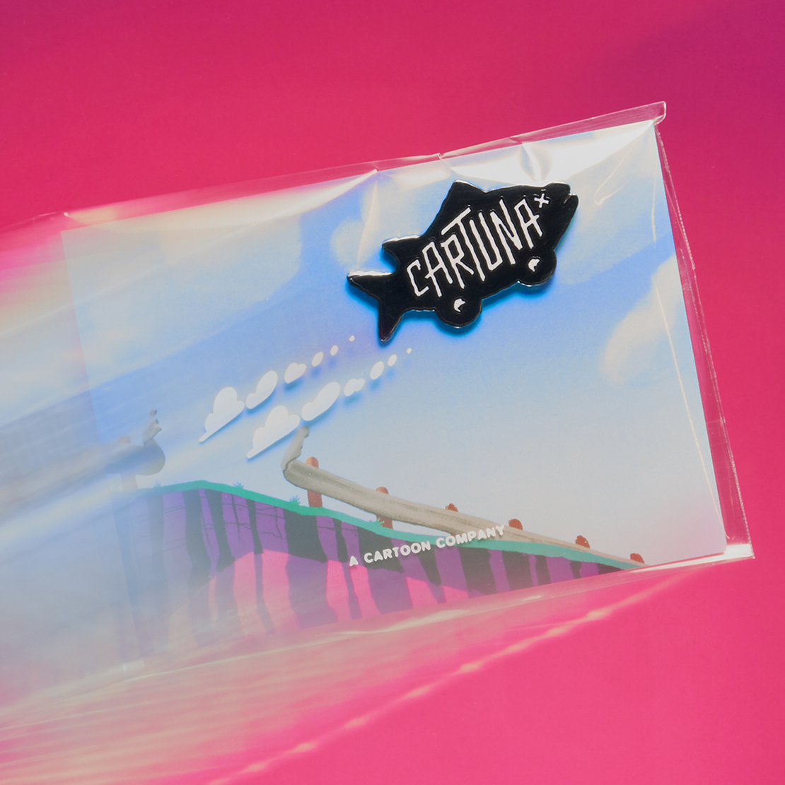
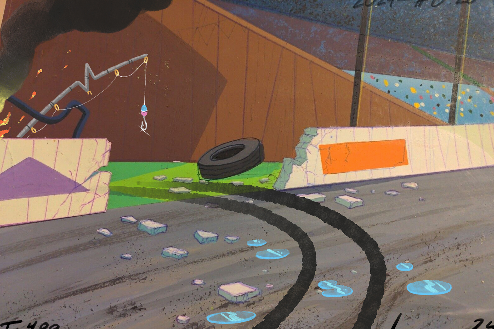
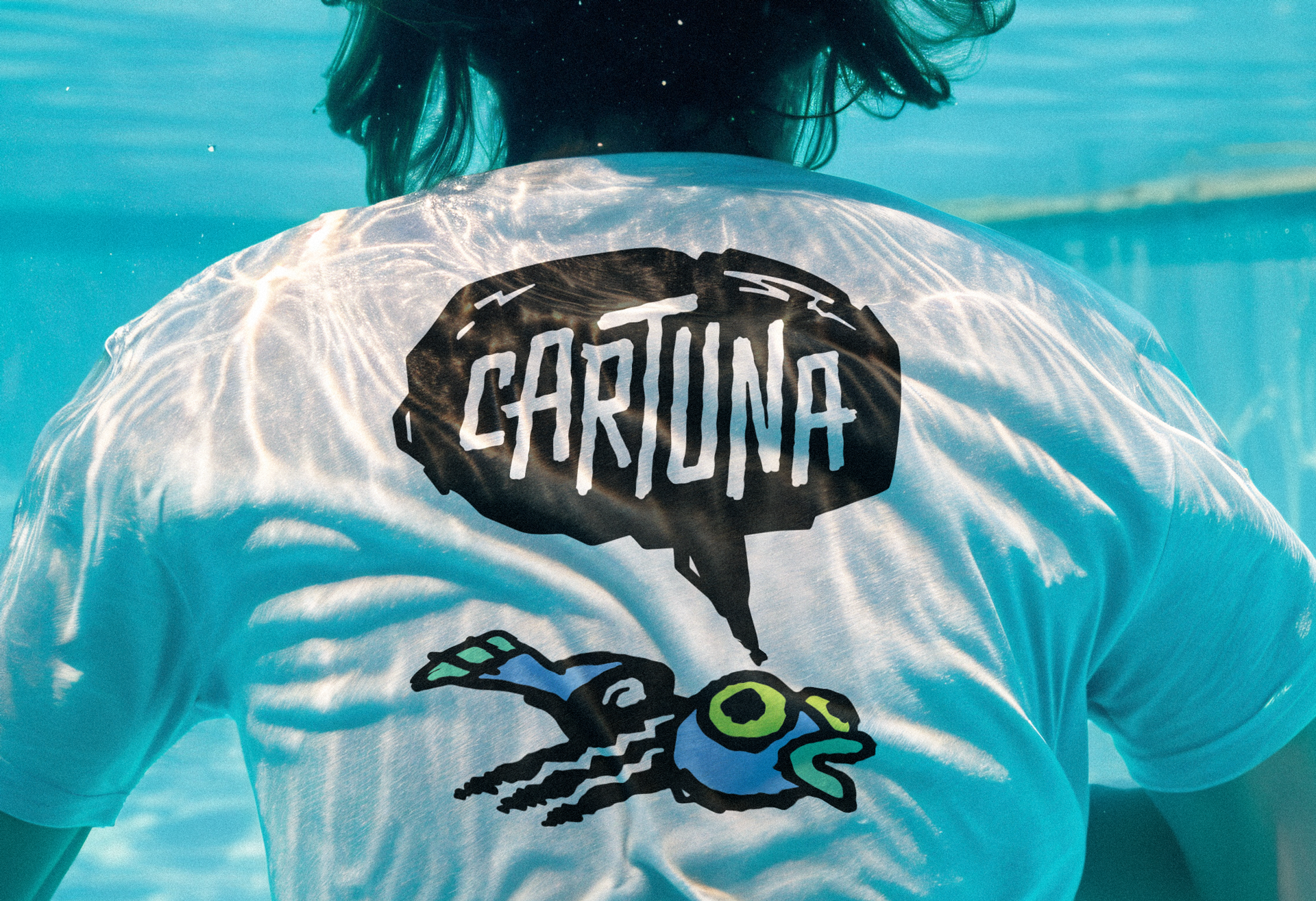
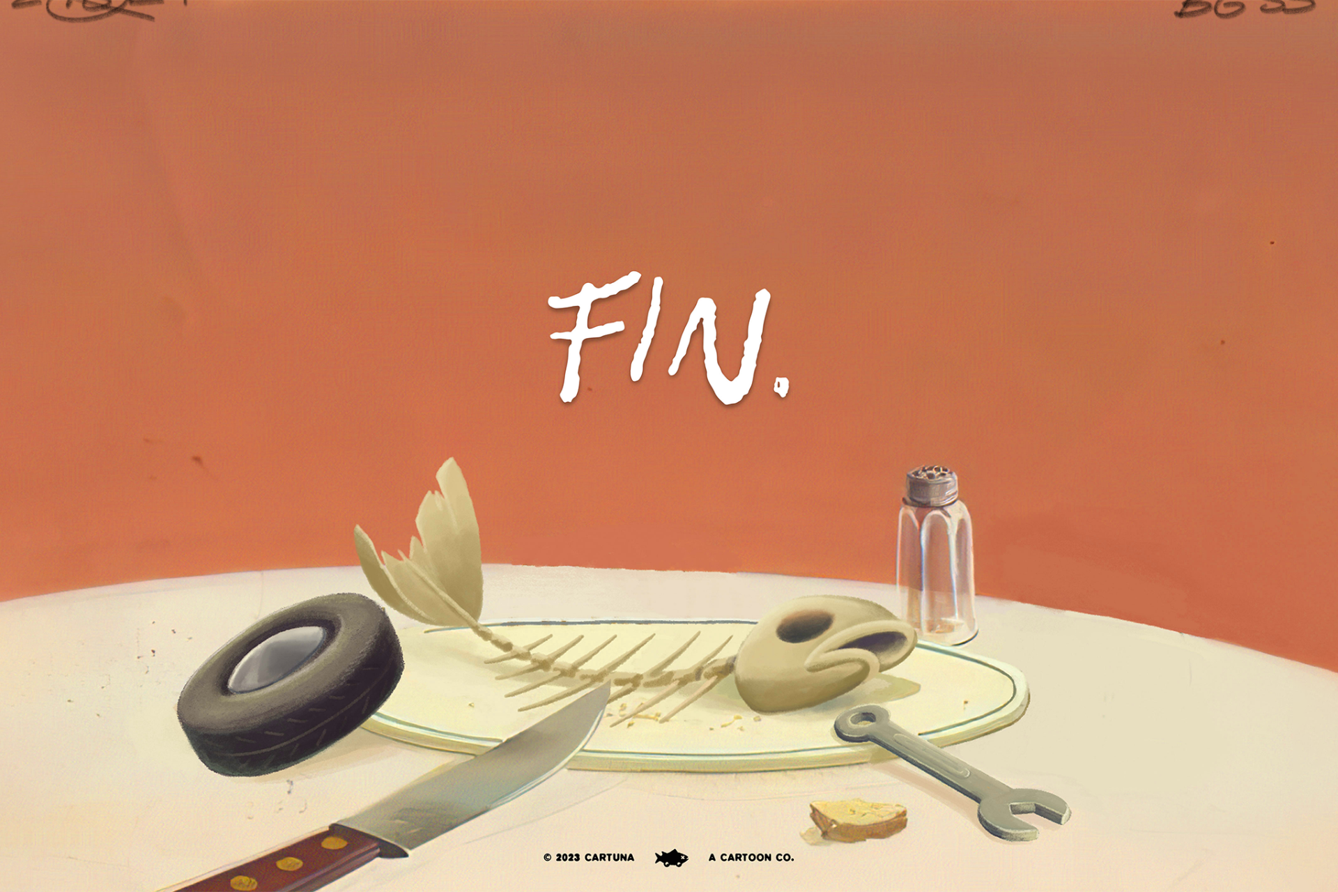
Inspired by the details of traditional animation production, Cartuna's brand identity uses elements like title cards, smear frames, and empty background paintings to create an elevated CARTOON design language.
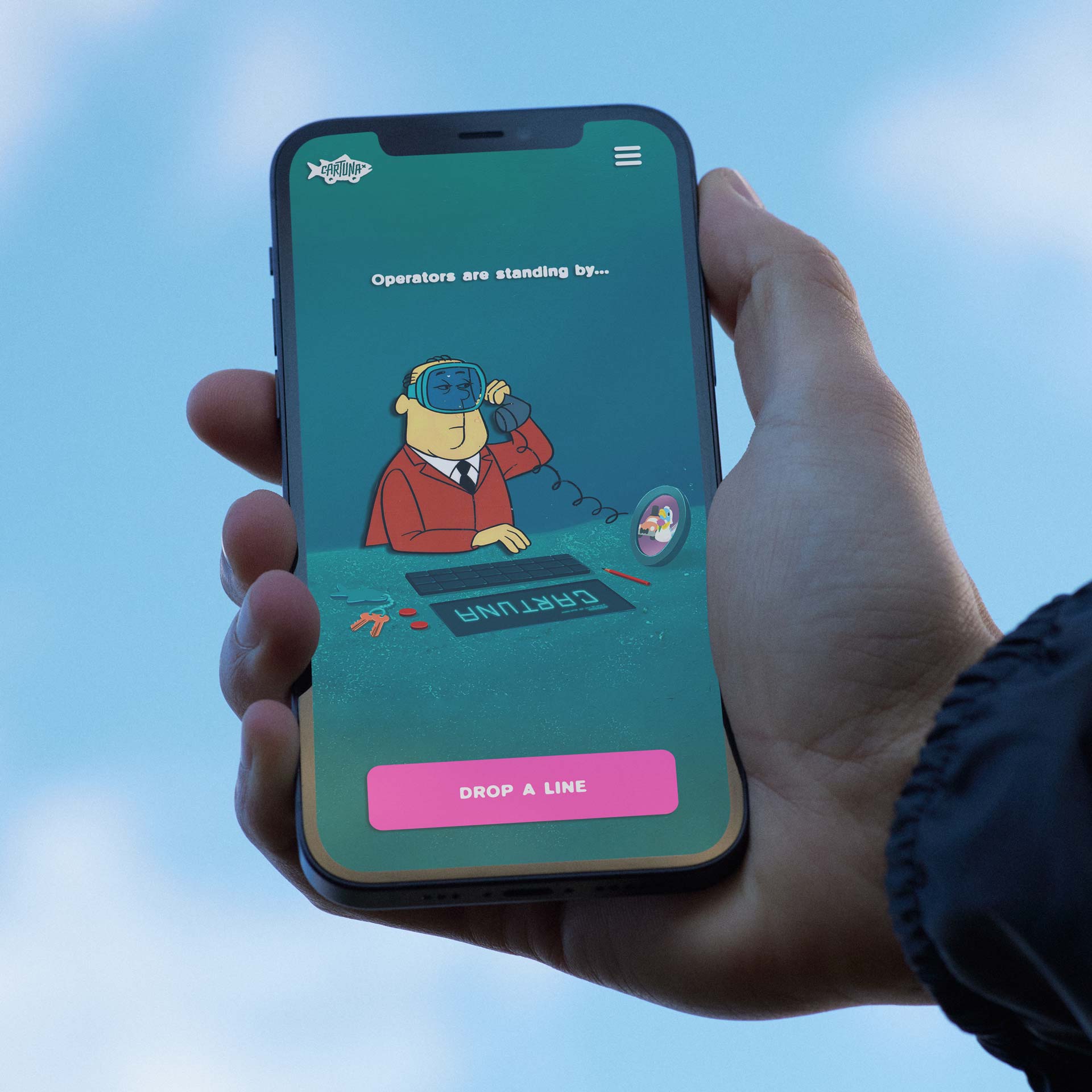
Refreshed brand icons embrace the playfulness and ambiguity of their name, while type families are informed by the smudged fine-print and loose scrawl of animator's timing notes.
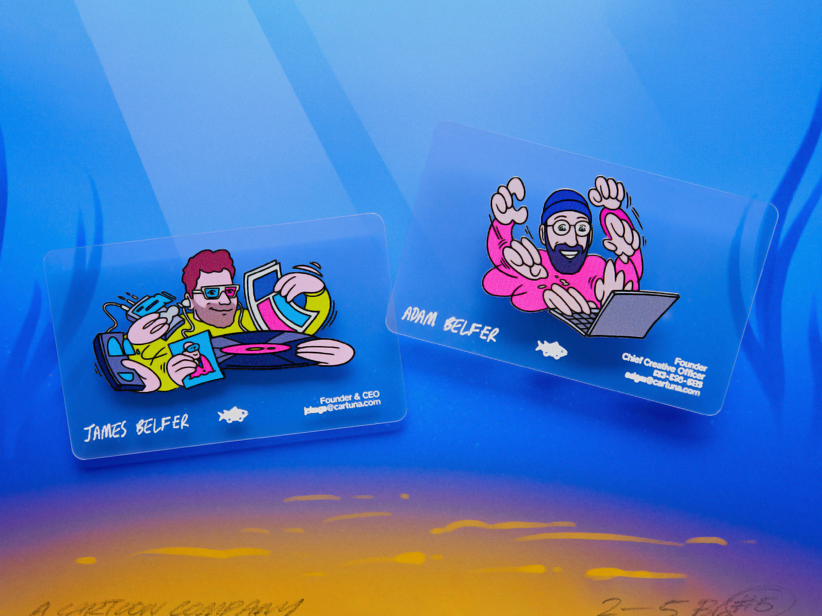
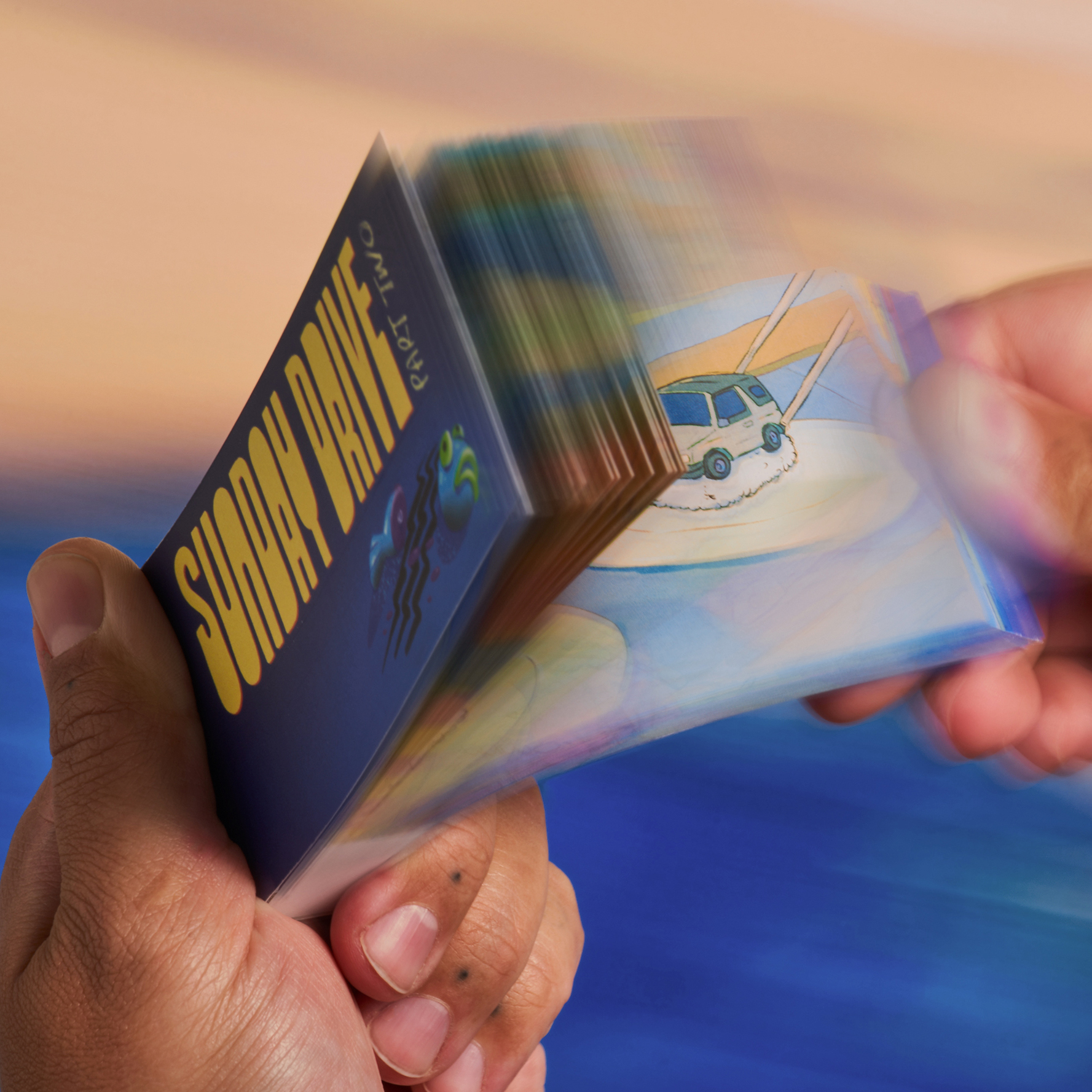
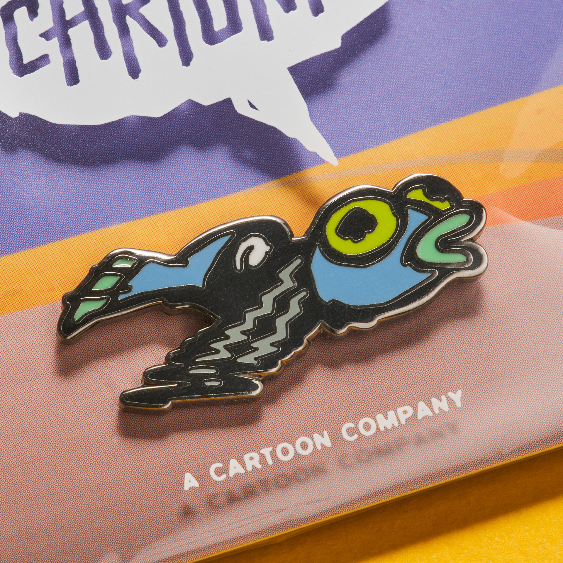
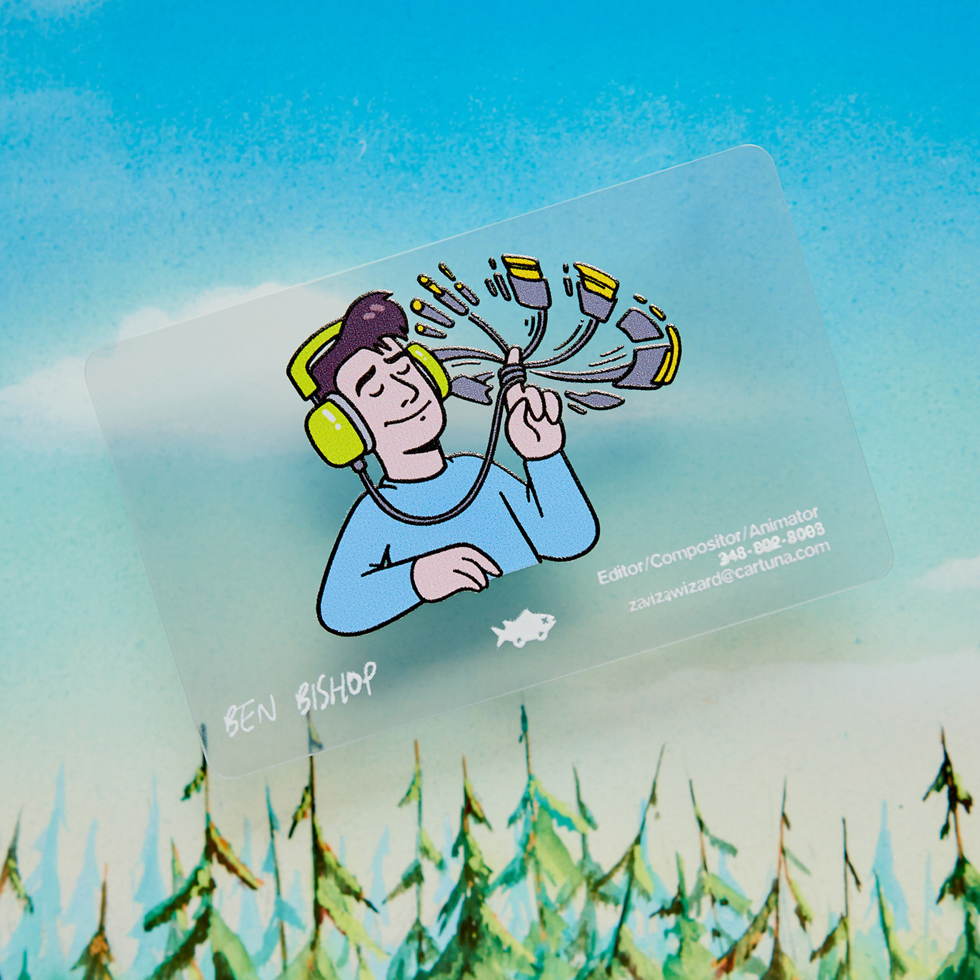
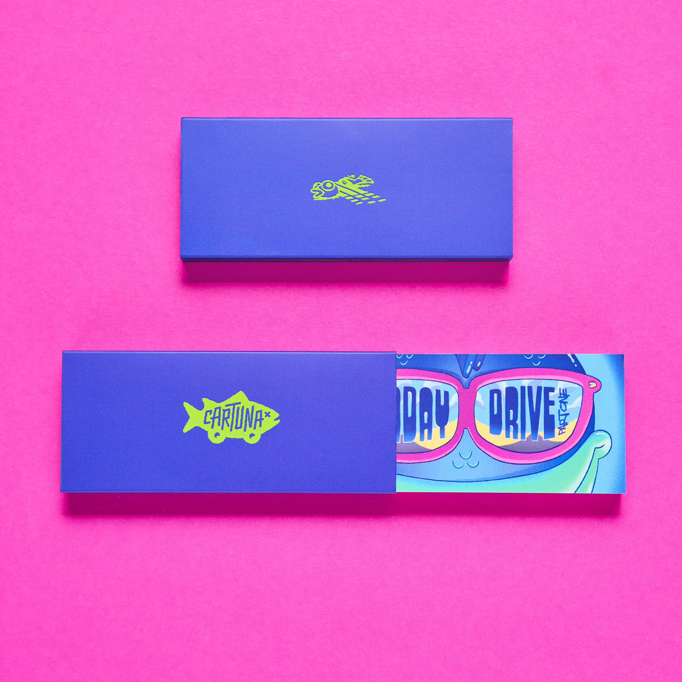
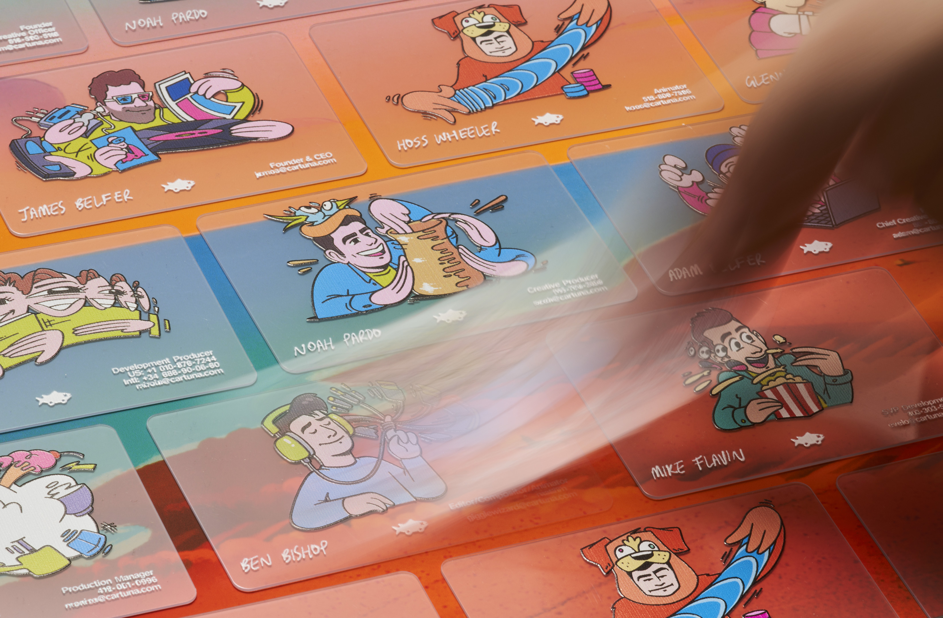
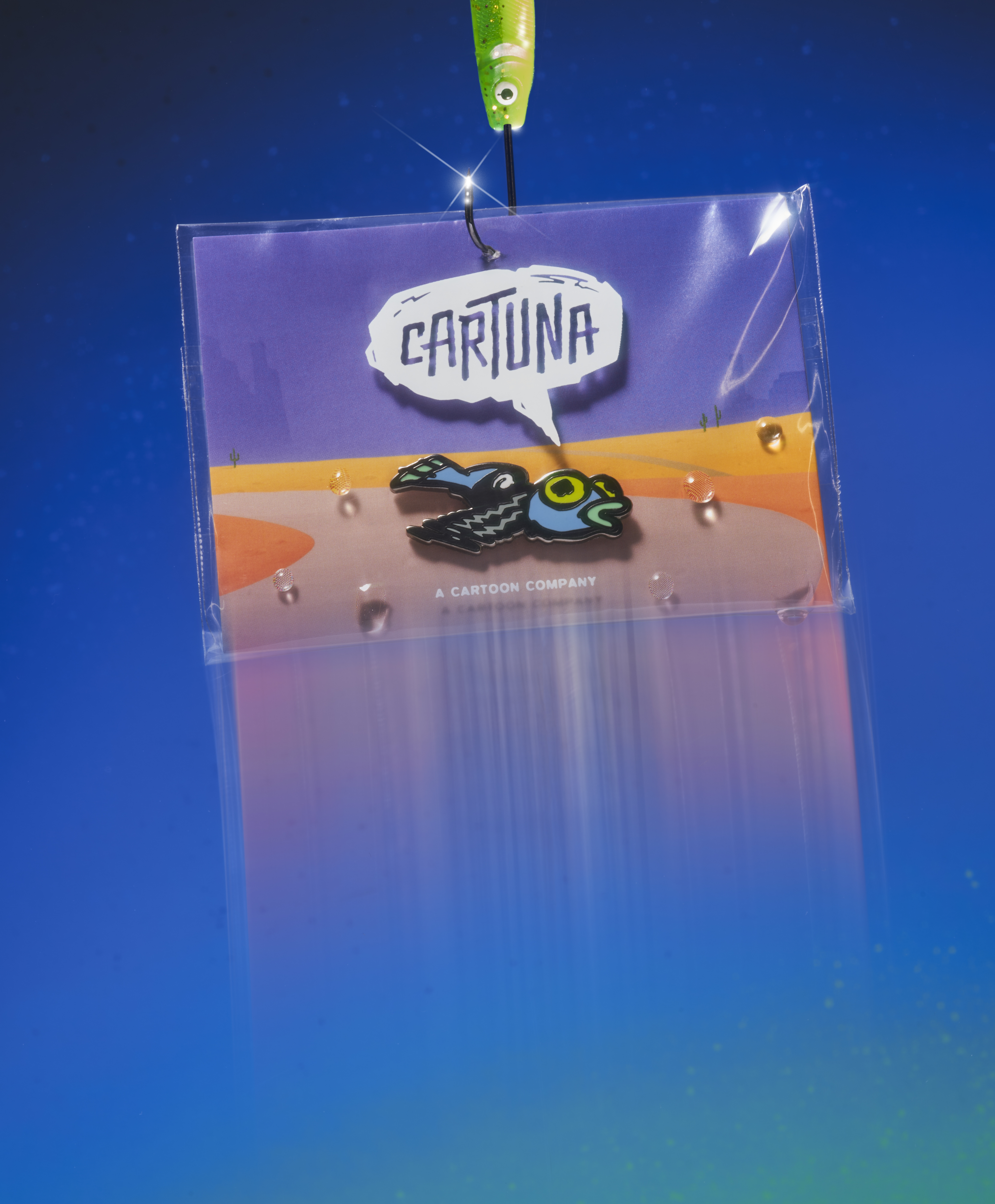
Transparent animation cel business cards, smear frame portraits of team members, flip books and pins were all developed as memorable conference takeaways, while long exposure brand photography recreated the smears and smudges of animation's most exciting moments.
Press: The Brand Identity